Corporate Financial Health Dashboard
This guide explains what the dashboard shows, where the data comes from, how the normalized scores are produced, and how to interpret each of the six scorecard cards. It is designed to live beside the dashboard and match the same visual language.
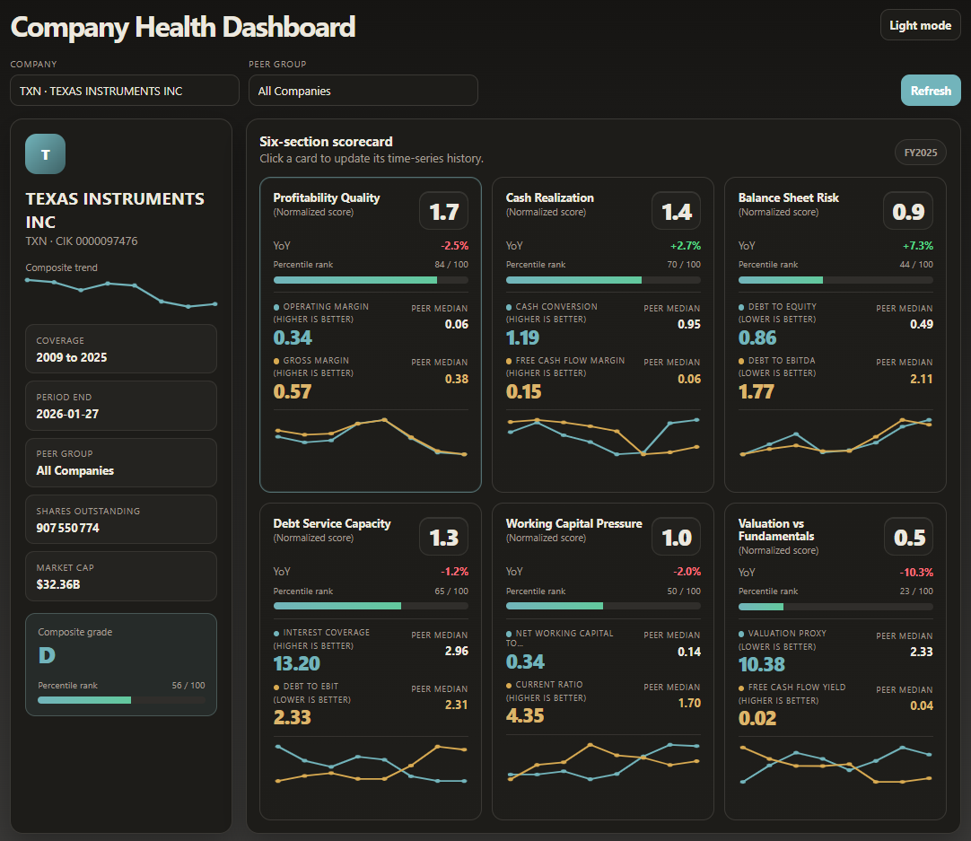
Purpose and data source
The dashboard summarizes the financial health of a public company by combining raw accounting and market signals into six recurring analytical themes: profitability quality, cash realization, balance sheet risk, debt service capacity, working capital pressure, and valuation versus fundamentals.
Company information, reporting periods, scorecard metrics, and market snapshots are all loaded from EDGAR public database of public company 10-K filings.
Page structure
How scoring works
Each raw metric is compared with a benchmark, typically a peer-group median for the same period. The metric is then converted into a percentile rank or normalized score according to the metric direction: for some ratios, a higher value is better; for leverage-style metrics, a lower value is better.
The section score is the average of the normalized metric scores that belong to the card. The overall composite score shown in the side panel is the average of the six section scores for the selected period.
Normalization logic
| Element | Meaning |
|---|---|
| Raw value | The company value for the selected period. |
| Peer median | The comparison baseline shown on the right side of each metric row. |
| Percentile rank | Relative standing from 0 to 100 against the selected peer group. |
| Normalized score | Card-level score computed from the underlying metric scores. |
| YoY | Year-over-year movement of the selected section or anchor metric. |
Six cards and formulas
| Card | Purpose | Main metrics | Typical formulas |
|---|---|---|---|
| Profitability Quality | Measures how efficiently revenue is converted into profit. | Operating Margin, Gross Margin | Operating Margin = EBIT / Revenue; Gross Margin = Gross Profit / Revenue |
| Cash Realization | Shows how accounting profit converts into cash generation. | Cash Conversion, Free Cash Flow Margin | Cash Conversion = Operating Cash Flow / Net Income (or EBIT proxy depending on dataset); FCF Margin = Free Cash Flow / Revenue |
| Balance Sheet Risk | Evaluates leverage pressure and balance-sheet fragility. | Debt to Equity, Debt to EBITDA | Debt to Equity = Total Debt / Net Equity; Debt to EBITDA = Total Debt / EBITDA |
| Debt Service Capacity | Assesses the firm's ability to carry and service debt. | Interest Coverage, Debt to EBIT | Interest Coverage = EBIT / Interest Expense; Debt to EBIT = Total Debt / EBIT |
| Working Capital Pressure | Captures liquidity and short-term operating flexibility. | Net Working Capital to Revenue, Current Ratio | NWC to Revenue = (Current Assets - Current Liabilities) / Revenue; Current Ratio = Current Assets / Current Liabilities |
| Valuation vs Fundamentals | Compares market valuation against operating and cash-generation fundamentals. | Valuation Proxy, Free Cash Flow Yield | Valuation Proxy may use EV/Sales, EV/EBITDA, P/E, or P/B depending on available fields; FCF Yield = Free Cash Flow / Market Capitalization |
www.soligale.com. All the contents presented on this website are only for demonstration purposes and must not be considered as investment advice.