I was thinking about how difficult it is to assess the financial state of large corporations, or to tell if a whole industry is under pressure or getting stronger. So I thought about something well-defined, quickly understandable, and also comparable between different companies, industries and periods. This is where I started building a financial-health dashboard to summarize and visualize different financial aspects of large companies.
The dashboard is available at https://drsoli.com/tools/04-financial_dashboard/. All the analyses are based on 10-K statements available on EDGAR database. This dashboard is only for demonstration, the analyses results were not validated and must not be trusted. The dashboard has three major parts:
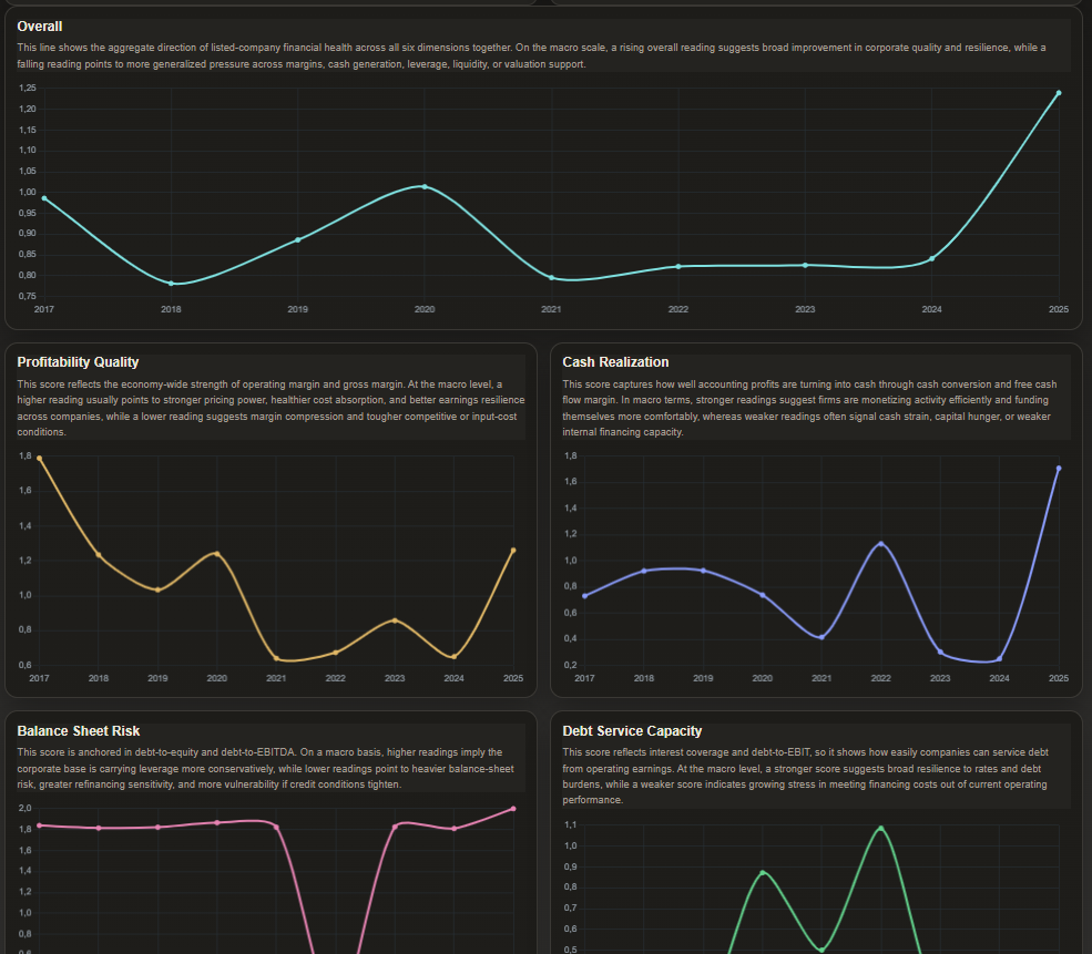
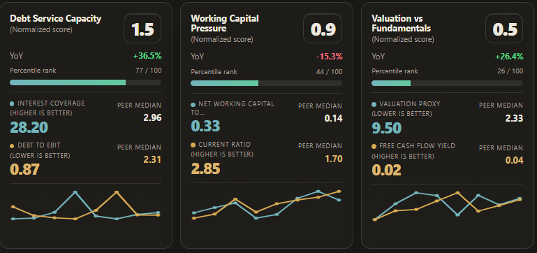
1- Company snapshots: this part shows a summary of financial health state of each company. It covers six major categories: Profit generation, Cash generation, Leverage risk, Interest pressure, Working capital pressure, Valuation. Each company is then compared to the peers in the same industry group and assigned a normalized score.
2- Top companies: this page lists the top companies in total or each category and can be sorted per score category and filtered per industry peer group.
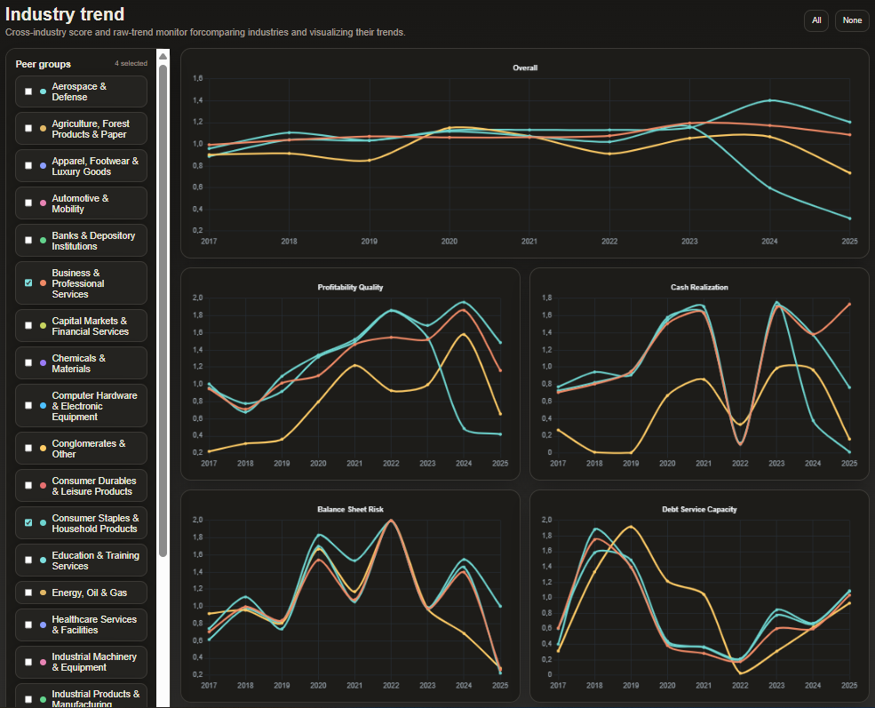
3- Industry trends and comparison: a page for comparing industries and detect their trends. Here we can have a snapshot of different industries and also compare them, e.g., which ones had trouble generating profit, or which ones were the most successful in reducing their interest burden.
4- Overall market trends: taking the states of companies altogether into consideration, gives a snapshot of the overall market and macro-economy state.